
A name that could sit with Christie's
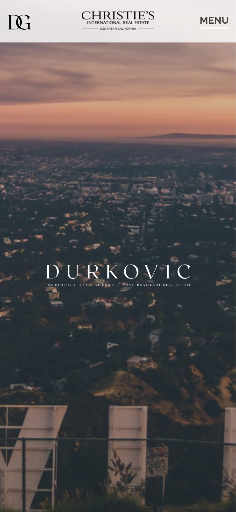
He didn't want a cousin of the partnership logo. We sent three directions in Figma, then a second round of type. He asked for more space in the letters, then a signature; we kept going until the serif wordmark and the stacked monogram could sit on a Christie's listing without looking borrowed. Type, color, and use went into a brand book.
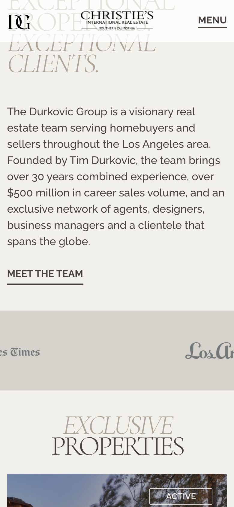
Built for the houses they actually sell
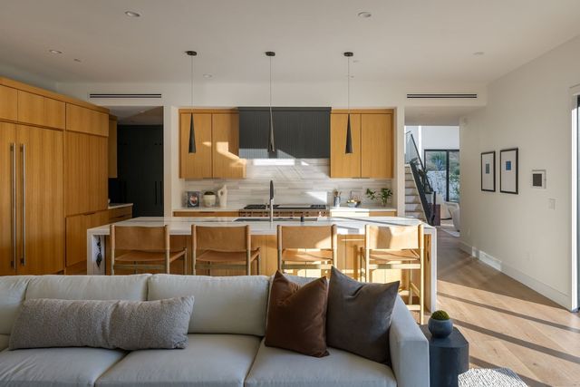
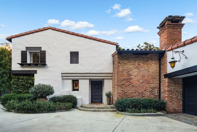
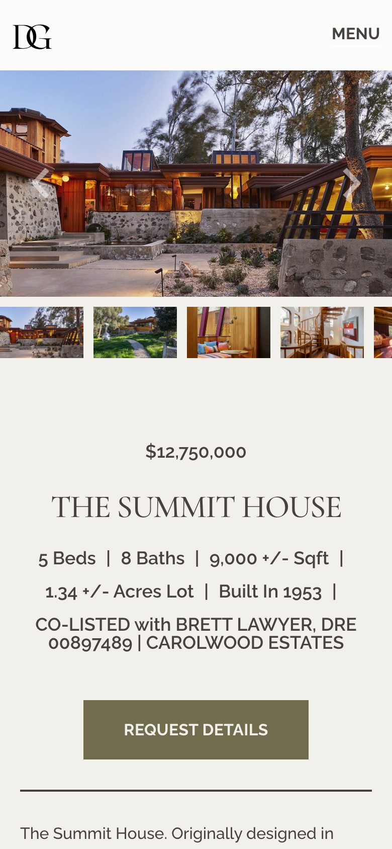
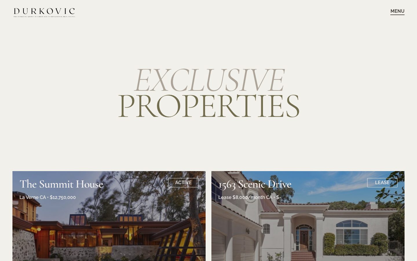
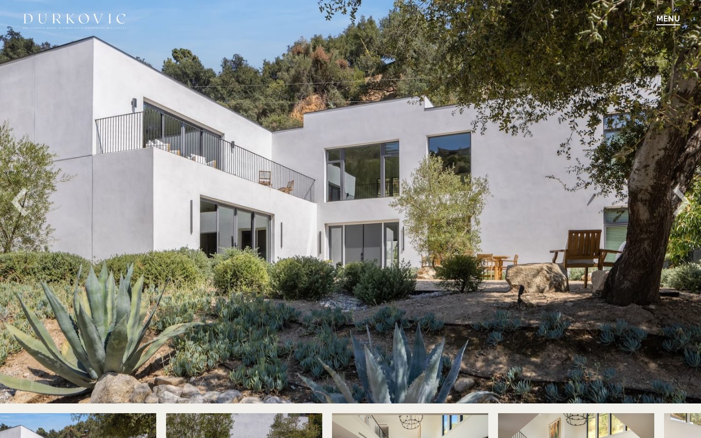
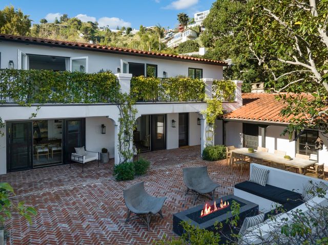
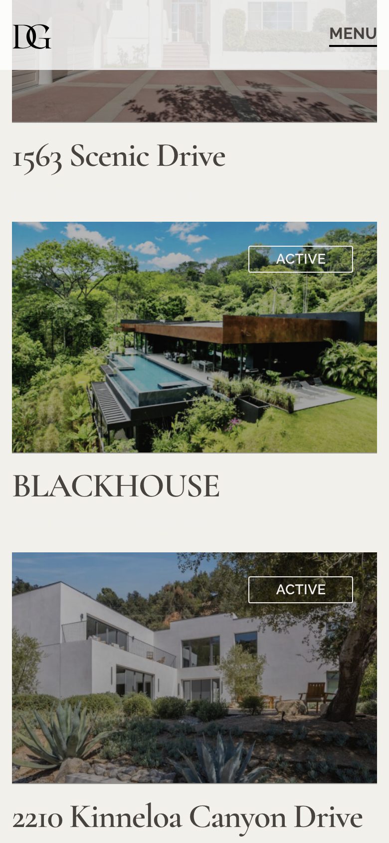
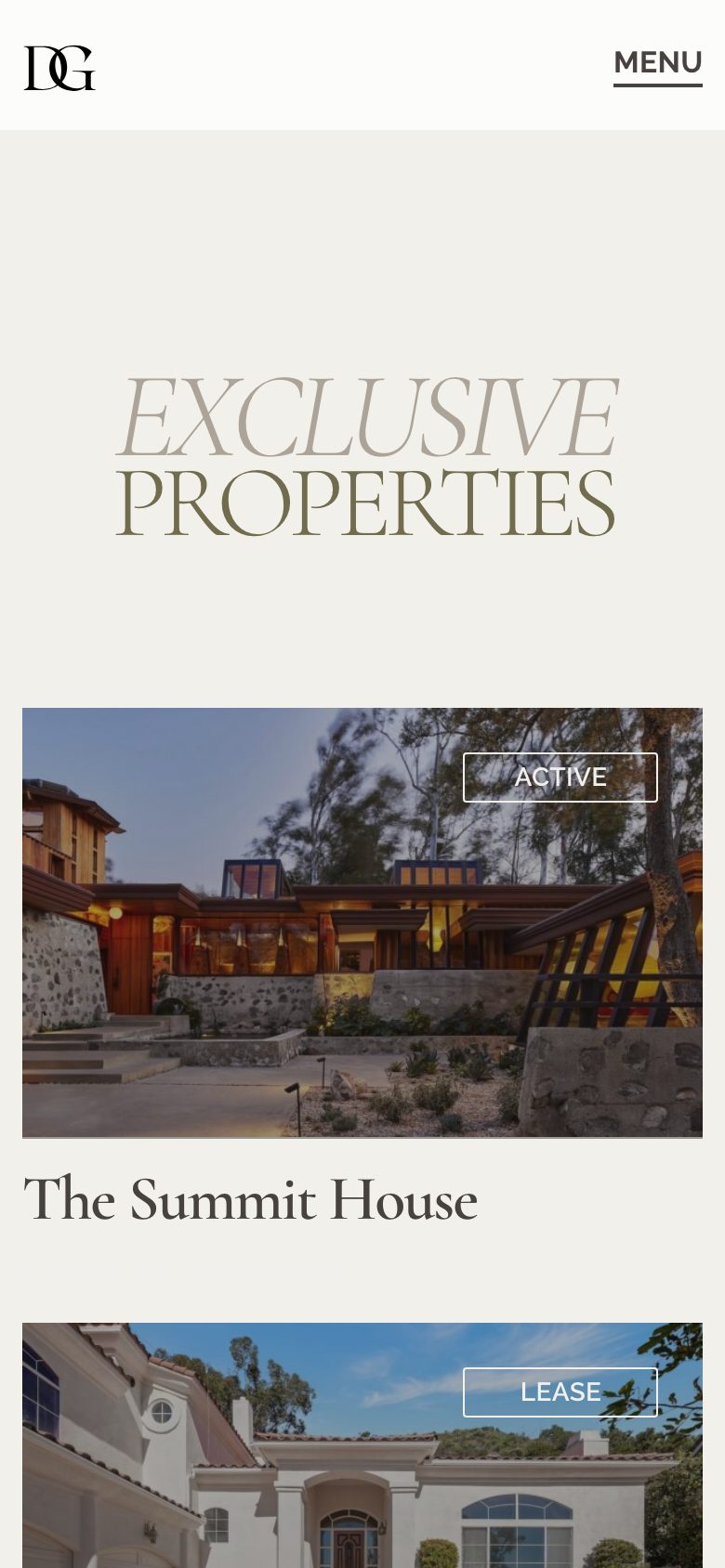
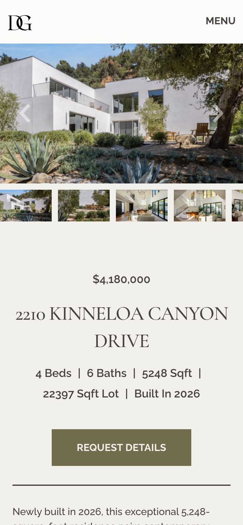
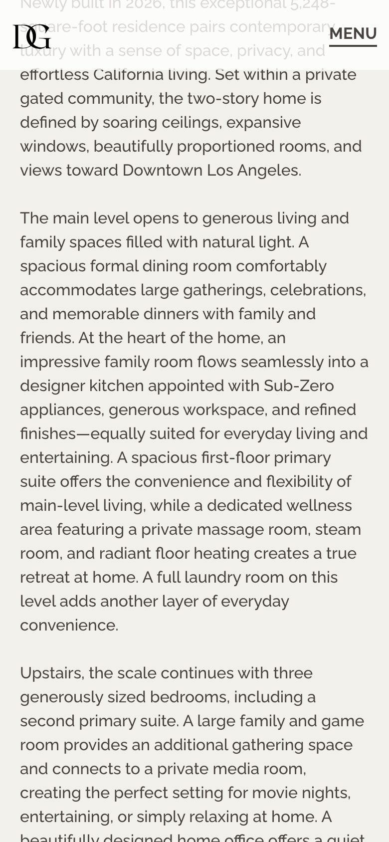
We treated each listing the way an auction house would. Photographs first, then price, beds, baths, square feet. Exclusive Properties is the grid; each house uses a template they fill in WordPress. A buyer looking at $12.75 million in La Verne, or a new build in Kinneloa Canyon, lands on the same template.
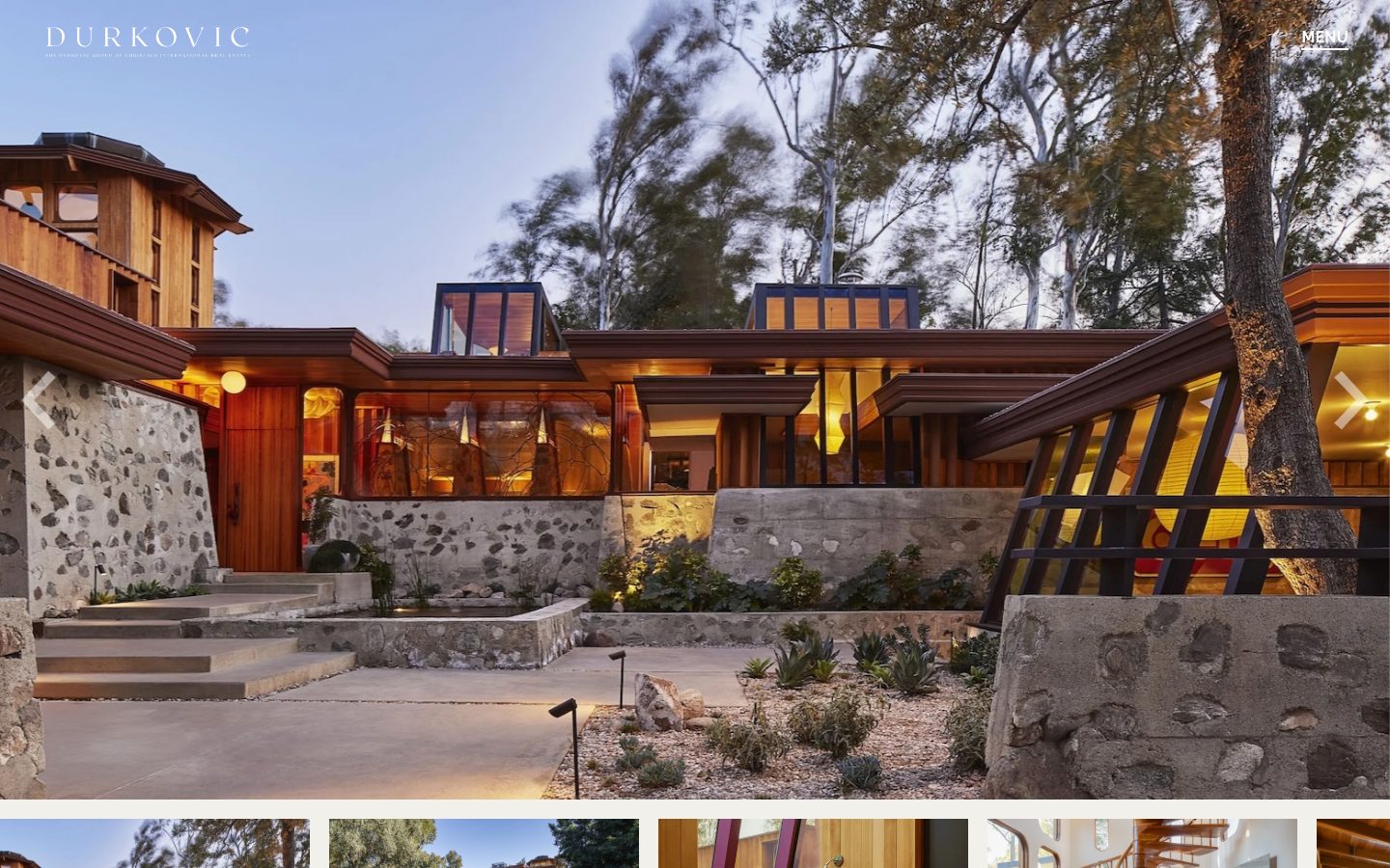
The Summit House
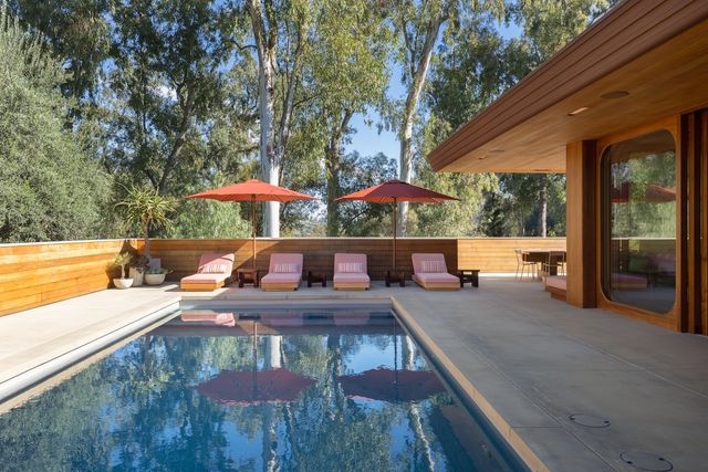
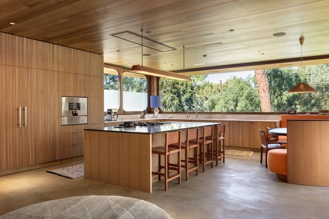
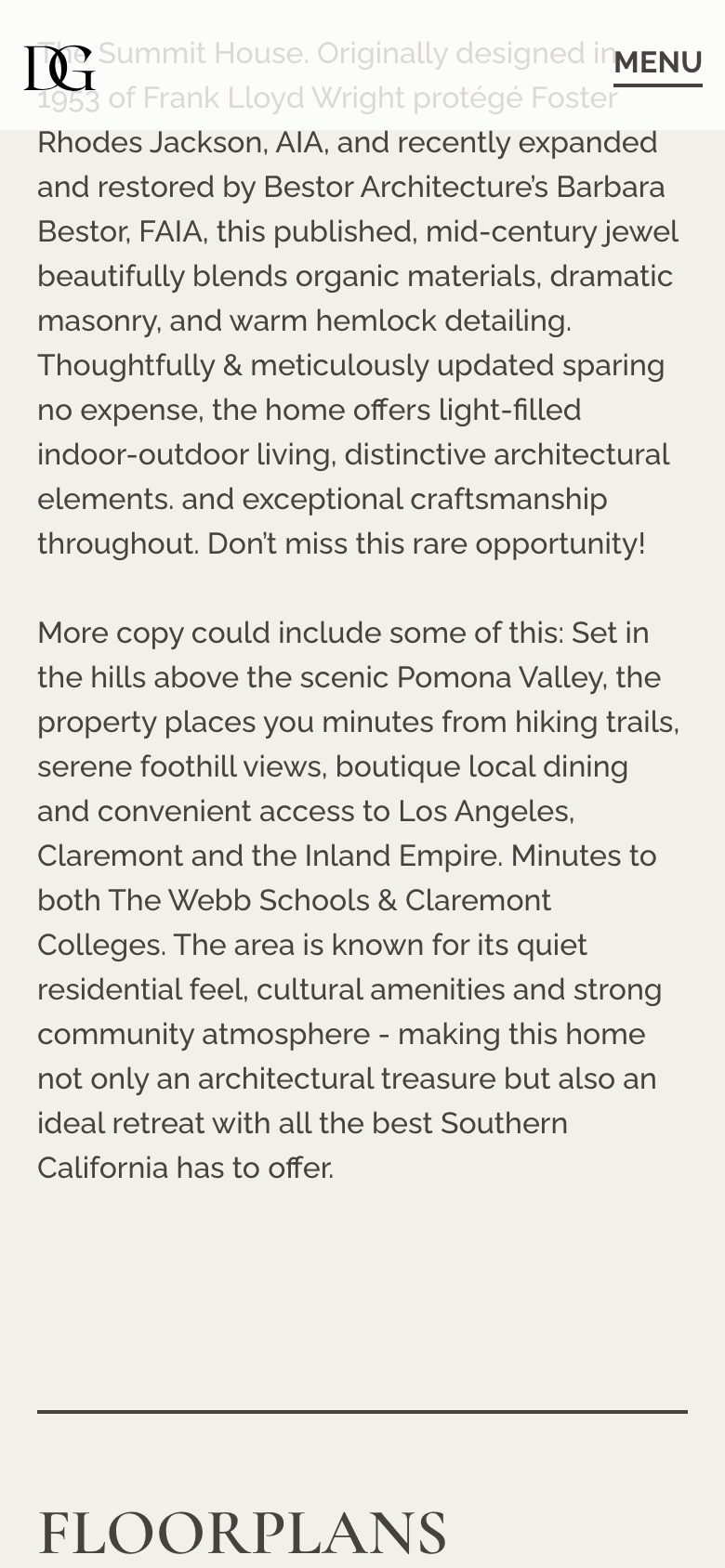
Foster Rhodes Jackson designed it in 1953. Barbara Bestor restored and expanded it. Five bedrooms, eight baths, 9,000 square feet in the hills above La Verne. The listing is a gallery first, and the desktop page is built to hold that.
The whole site, page by page
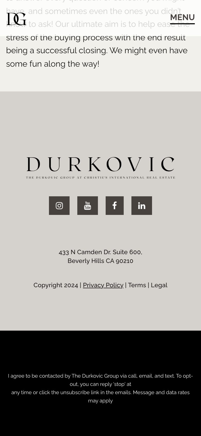
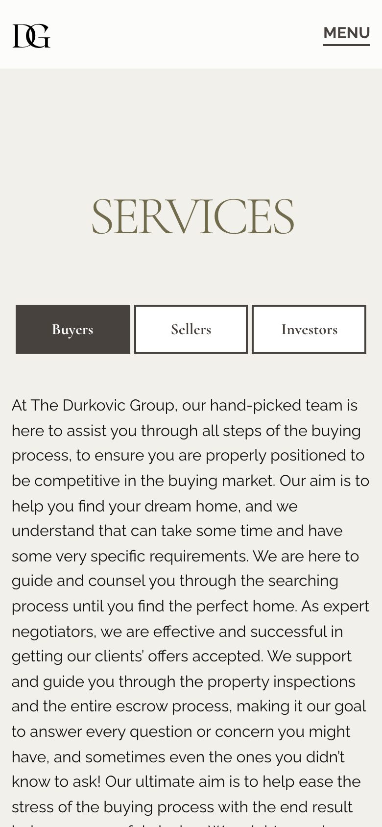
Home, Exclusive Properties, the listings, About, and Services share one system: the black ground, the gold serif, the stacked Durkovic mark. We built them together so a buyer can go from the grid to The Summit House without feeling like they switched sites.
Black, stone, and gold
Black is the ground. Gold is the name. Stone is the page. They log into WordPress and add listings; the brand book is there when the next one needs to look like Durkovic.